Swiss Typewriter
Swiss Typewriter is a Helvetic interpretation of its famous cousin American Typewriter, originally designed by Joel Kaden and Tony Stan for the International Typeface Corporation (ITC). Like its cousin, Swiss Typewriter has proportional widths and is therefore not a monospaced typewriter face. Unlike its cousin, though, Swiss Typewriter avoids nostalgic references to the squashed, blurry appearance of earlier printed documents, instead taking on a more minimalist, industrial character. It also features a true italic, with the slab serifs curved into swashes.
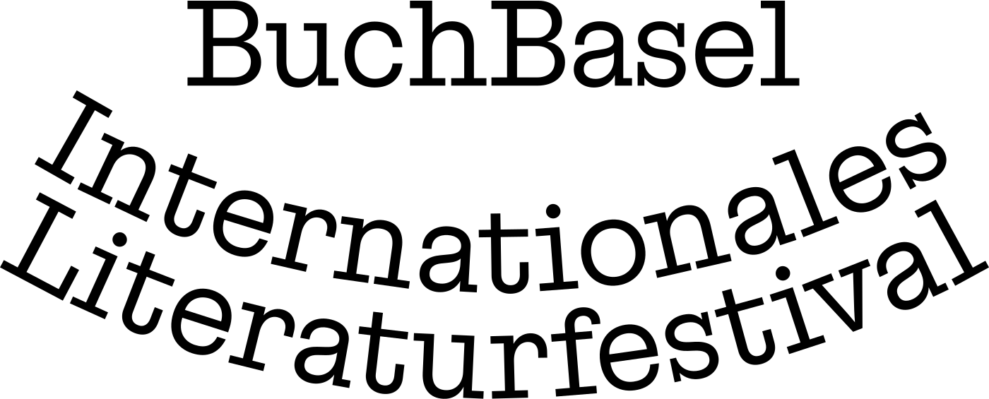
We originally developed Swiss Typewriter for the visual identity redesign of BuchBasel, an international literary festival. BuchBasel had previously used another serif-heavy typeface, a Clarendon. Our aim was to give the festival a younger, more contemporary look, with a low-contrast slab serif typeface and a friendly character. BuchBasel has used the typeface ever since, across all print materials and digital communications.

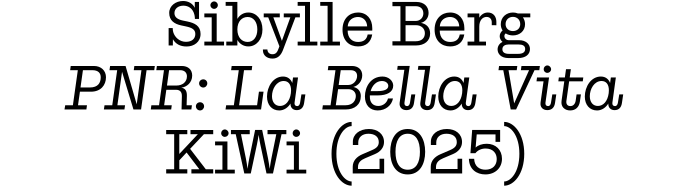
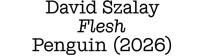
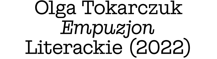
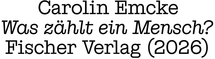

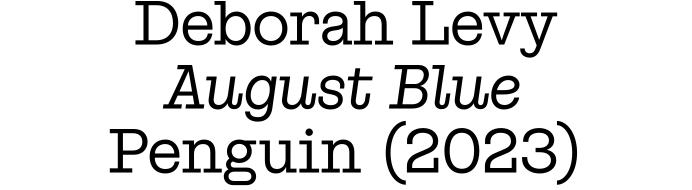
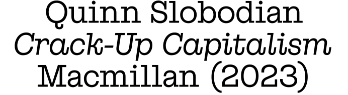
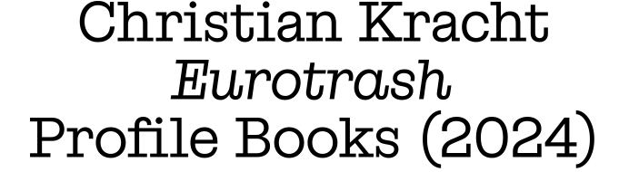
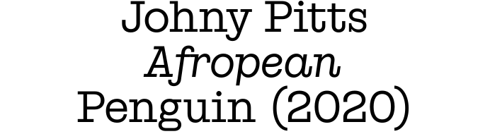
Every November, around a hundred authors gather in Basel to read from their works, discuss them publicly, and engage with the audience. Among them: Nobel laureates and Booker Prize winners, established names and mid-weight heavyweights, as well as distinctly independent voices from many regions of the world. When set in Swiss Typewriter, they are all presented at the same size; existing hierarchies should not be visually reinforced any further.
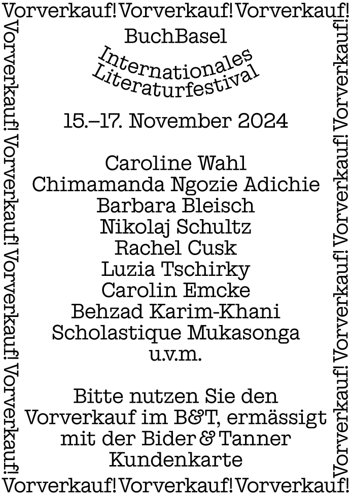
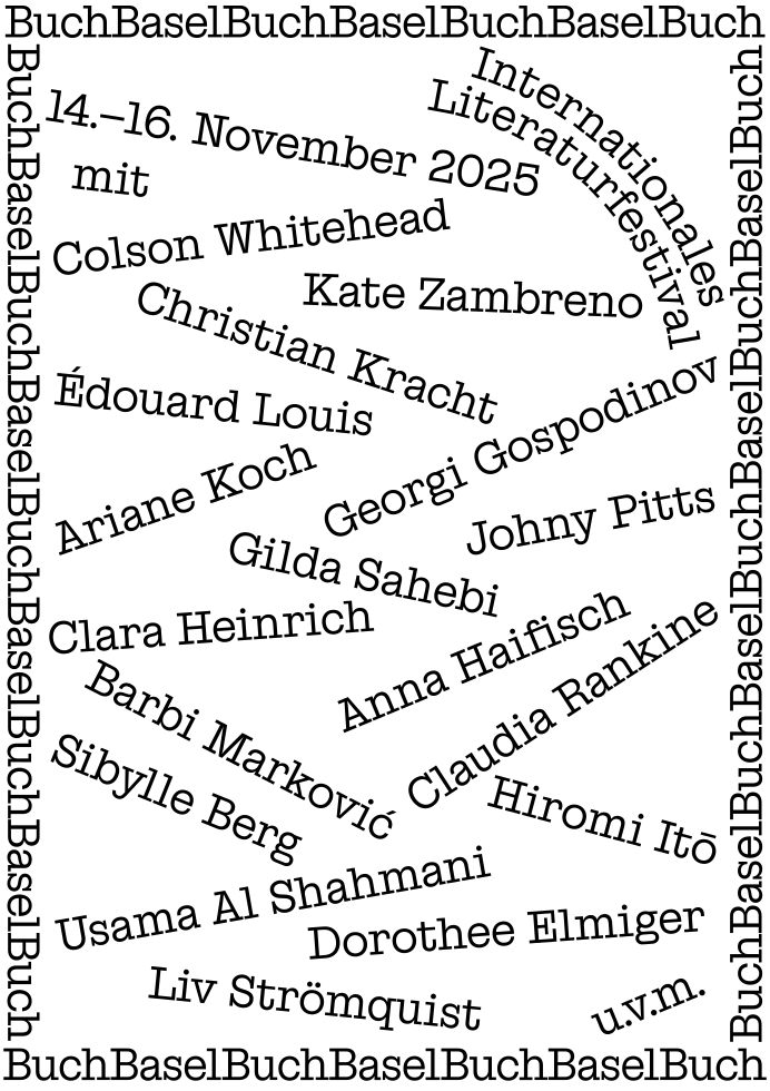
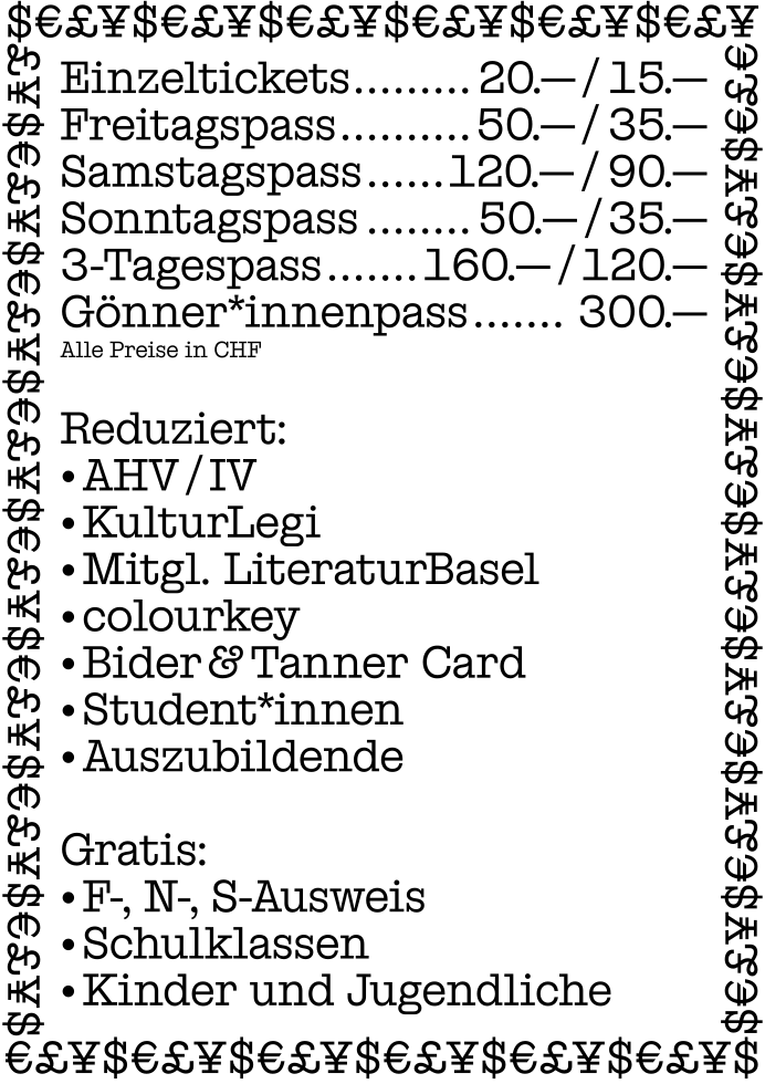
BuchBasel’s overall communication is highly type-centric, which is not unusual in the world of literature. This makes the formal characteristics of the typeface even more significant, as they help define the identity of the festival. Above are some examples of BuchBasel posters set in Swiss Typewriter.
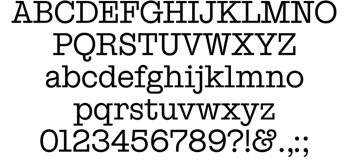
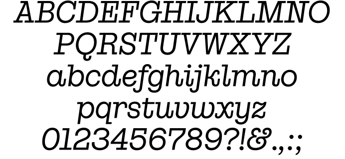

Shout out to Milton Glaser!
Uppercase Latin
- A
- Á
- Ă
- Â
- Ä
- Ạ
- À
- Ā
- Ą
- Å
- Ã
- Æ
- Ǽ
- B
- C
- Ć
- Č
- Ç
- Ĉ
- Ċ
- D
- Ð
- Ď
- Đ
- E
- É
- Ĕ
- Ě
- Ê
- Ë
- Ė
- Ẹ
- È
- Ē
- Ę
- Ẽ
- Ə
- F
- G
- Ğ
- Ǧ
- Ĝ
- Ģ
- Ġ
- H
- Ħ
- Ĥ
- I
- Í
- Ĭ
- Î
- Ï
- İ
- Ị
- Ì
- Ī
- Į
- Ĩ
- IJ
- J
- Ĵ
- K
- Ķ
- L
- Ĺ
- Ľ
- Ļ
- Ŀ
- Ł
- M
- N
- Ń
- Ň
- Ņ
- Ɲ
- Ñ
- Ŋ
- O
- Ó
- Ŏ
- Ô
- Ö
- Ọ
- Ò
- Ő
- Ō
- Ǫ
- Ø
- Ǿ
- Õ
- Œ
- P
- Þ
- Q
- R
- Ŕ
- Ř
- Ŗ
- S
- Ś
- Š
- Ş
- Ŝ
- Ș
- ẞ
- T
- Ŧ
- Ť
- Ţ
- Ț
- U
- Ú
- Ŭ
- Û
- Ü
- Ụ
- Ù
- Ű
- Ū
- Ų
- Ů
- Ũ
- V
- W
- Ẃ
- Ŵ
- Ẅ
- Ẁ
- X
- Y
- Ý
- Ŷ
- Ÿ
- Ỳ
- Ȳ
- Ỹ
- Z
- Ź
- Ž
- Ż
Lowercase Latin
- a
- á
- ă
- â
- ä
- ạ
- à
- ā
- ą
- å
- ã
- æ
- ǽ
- b
- c
- ć
- č
- ç
- ĉ
- ċ
- d
- ð
- ď
- đ
- e
- é
- ĕ
- ě
- ê
- ë
- ė
- ẹ
- è
- ē
- ę
- ẽ
- ə
- f
- g
- ğ
- ǧ
- ĝ
- ģ
- ġ
- h
- ħ
- ĥ
- i
- ı
- í
- ĭ
- î
- ï
- ị
- ì
- ī
- į
- ĩ
- ij
- j
- ȷ
- ĵ
- k
- ķ
- ĸ
- l
- ĺ
- ľ
- ļ
- ŀ
- ł
- m
- n
- ń
- ʼn
- ň
- ņ
- ɲ
- ñ
- ŋ
- o
- ó
- ŏ
- ô
- ö
- ọ
- ò
- ő
- ō
- ǫ
- ø
- ǿ
- õ
- œ
- p
- þ
- q
- r
- ŕ
- ř
- ŗ
- s
- ś
- š
- ş
- ŝ
- ș
- ß
- t
- ŧ
- ť
- ţ
- ț
- u
- ú
- ŭ
- û
- ü
- ụ
- ù
- ű
- ū
- ų
- ů
- ũ
- v
- w
- ẃ
- ŵ
- ẅ
- ẁ
- x
- y
- ý
- ŷ
- ÿ
- ỳ
- ȳ
- ỹ
- z
- ź
- ž
- ż
Ligatures
Alternates
Figures
- 0
- 1
- 2
- 3
- 4
- 5
- 6
- 7
- 8
- 9
Tabular
Currency
- ¤
- $
- €
- £
- ¥
Math
- +
- −
- ×
- ÷
- =
- >
- <
- ±
- ~
- ¬
- ^
- %
Arrows
- ↑
- ↗
- →
- ↘
- ↓
- ↙
- ←
- ↖
- ↔
- ↕
Punctuation
- .
- ,
- :
- ;
- …
- !
- ¡
- ?
- ¿
- ·
- •
- *
- #
- /
- \
- -
- –
- —
- _
- (
- )
- {
- }
- [
- ]
- ‚
- „
- “
- ”
- ‘
- ’
- «
- »
- ‹
- ›
- "
- '
Symbols
- ○
- ♥
- @
- &
- ©
- ®
- ™
- °
- †
Marks
- ¨
- ˙
- `
- ´
- ˝
- ˆ
- ˇ
- ˘
- ˚
- ˜
- ¯
- ¸
- ˛
Swiss Typewriter was developed in 2021. A big thank you to the BuchBasel team for their trust and support, especially Marion Regenscheit, Valentina Bischof and Alice Weniger. Yves Graber designed most of the applications, including the posters shown above, while extensively testing the typeface and contributing suggestions for improvements. Miguel Almeida also tested an early version, and his input helped improve the kerning. Swiss Typewriter is currently being expanded with additional weights and will soon be available as a retail typeface.