Staniol
Staniol is the first typeface we are releasing for retail. Staniol is the German word for tin foil, a malleable material that can be shaped into precise object with sharp edges. The name captures something of the typeface itself: the openness and legibility of the humanist structure are shaped through the control and mathematical precision of geometric drawing. The tension between these two contrasting concepts, together with the sharp vertical terminals, gives Staniol its character. Think of Adrian Frutiger’s Frutiger as Paul Renner might have drawn it.
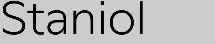
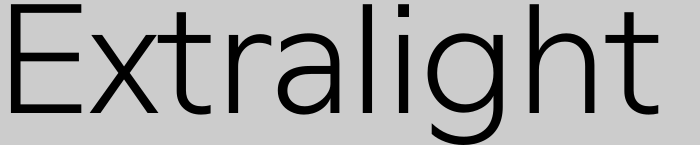
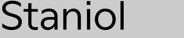




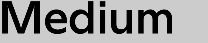

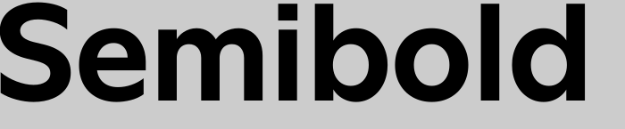




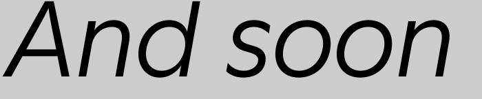

Staniol comes in seven weights, from Extralight to Extrabold. Each style has just under 800 glyphs and supports 221 Latin-script languages. Only Skolt Sámi and Vietnamese are missing (for now). We paid close attention to character coverage: every letter, diacritic and punctuation mark was drawn with the same care. Italics in matching weights are in production and scheduled for completion by the end of 2026.


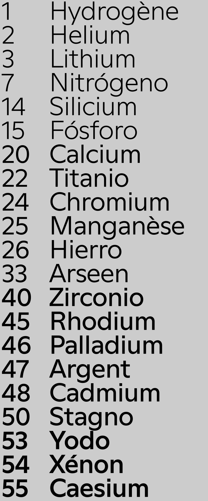
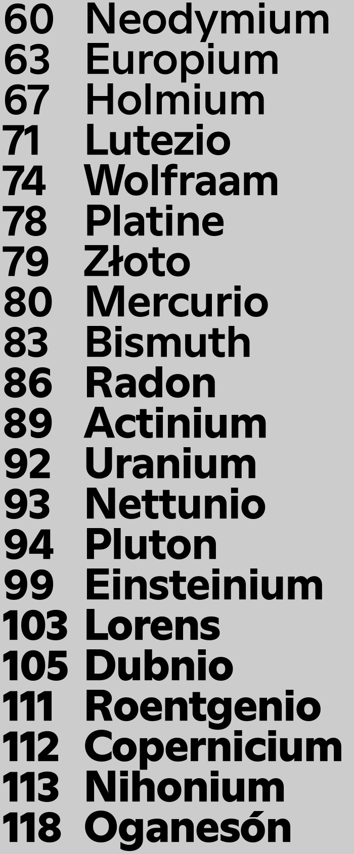
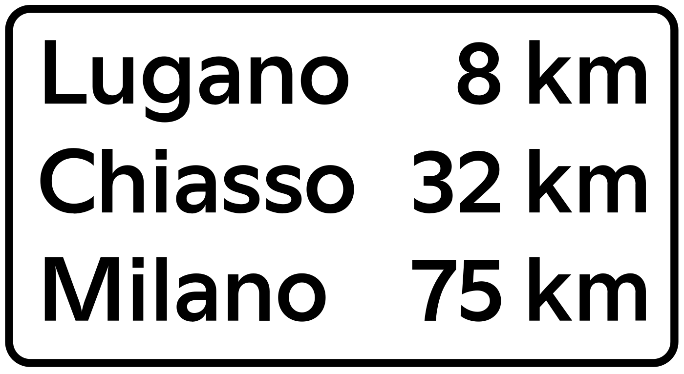
Staniol is designed for editorial use and remains legible at small sizes, even in Extrabold. To keep the typeface contemporary, we left out oldstyle figures, but drew the default figures slightly shorter than the cap height, giving running text an even colour. The case feature adapts punctuation for all-capital settings and also switches the figures to full cap height. Tabular figures also use full cap height. Further features include automatic fractions, circled figures, keyboard-accessible arrows, as well as a stylistic set that replaces the standard letter forms with schoolbook shapes.


Uppercase Latin
- A
- Á
- Ă
- Ǎ
- Â
- Ä
- Ạ
- À
- Ā
- Ą
- Å
- Ã
- Æ
- Ǽ
- B
- C
- Ć
- Č
- Ç
- Ĉ
- Ċ
- D
- Ð
- Ď
- Đ
- E
- É
- Ĕ
- Ě
- Ê
- Ë
- Ė
- Ẹ
- È
- Ē
- Ę
- Ẽ
- Ə
- F
- G
- Ğ
- Ǧ
- Ĝ
- Ģ
- Ġ
- Ḡ
- H
- Ħ
- Ĥ
- I
- Í
- Ĭ
- Î
- Ï
- İ
- Ị
- Ì
- Ī
- Į
- Ĩ
- IJ
- J
- Ĵ
- K
- Ķ
- L
- Ĺ
- Ľ
- Ļ
- Ŀ
- Ł
- M
- N
- Ń
- Ň
- Ņ
- Ɲ
- Ñ
- Ŋ
- O
- Ó
- Ŏ
- Ô
- Ö
- Ọ
- Ò
- Ő
- Ō
- Ǫ
- Ø
- Ǿ
- Õ
- Œ
- P
- Þ
- Q
- R
- Ŕ
- Ř
- Ŗ
- S
- Ś
- Ꞌ
- Š
- Ş
- Ŝ
- Ș
- ẞ
- T
- Ŧ
- Ť
- Ţ
- Ț
- U
- Ú
- Ŭ
- Û
- Ü
- Ụ
- Ù
- Ű
- Ū
- Ų
- Ů
- Ũ
- V
- W
- Ẃ
- Ŵ
- Ẅ
- Ẁ
- X
- Y
- Ý
- Ŷ
- Ÿ
- Ỳ
- Ȳ
- Ỹ
- Z
- Ź
- Ž
- Ż
Lowercase Latin
- a
- á
- ă
- ǎ
- â
- ä
- ạ
- à
- ā
- ą
- å
- ã
- æ
- ǽ
- b
- c
- ć
- č
- ç
- ĉ
- ċ
- d
- ð
- ď
- đ
- e
- é
- ĕ
- ě
- ê
- ë
- ė
- ẹ
- è
- ē
- ę
- ẽ
- ə
- f
- g
- ğ
- ǧ
- ĝ
- ģ
- ġ
- ḡ
- h
- ħ
- ĥ
- i
- ı
- í
- ĭ
- î
- ï
- ị
- ì
- ī
- į
- ĩ
- ij
- j
- ȷ
- ĵ
- k
- ķ
- ĸ
- l
- ĺ
- ľ
- ļ
- ŀ
- ł
- m
- n
- ń
- ʼn
- ň
- ņ
- ɲ
- ñ
- ŋ
- o
- ó
- ŏ
- ô
- ö
- ọ
- ò
- ő
- ō
- ǫ
- ø
- ǿ
- õ
- œ
- p
- þ
- q
- r
- ŕ
- ř
- ŗ
- s
- ś
- ꞌ
- š
- ş
- ŝ
- ș
- ß
- t
- ŧ
- ť
- ţ
- ț
- u
- ú
- ŭ
- û
- ü
- ụ
- ù
- ű
- ū
- ų
- ů
- ũ
- v
- w
- ẃ
- ŵ
- ẅ
- ẁ
- x
- y
- ý
- ŷ
- ÿ
- ỳ
- ȳ
- ỹ
- z
- ź
- ž
- ż
Uppercase (Greek)
- Α
- Β
- Γ
- Δ
- Μ
- Π
- Σ
- Ω
Lowercase (Greek)
- α
- β
- γ
- δ
- μ
- π
- σ
- ω
Ligatures
- ff
- fi
- fl
Alternates
Case Sensitive
Figures
- 0
- 1
- 2
- 3
- 4
- 5
- 6
- 7
- 8
- 9
- ⓿
- ❶
- ❷
- ❸
- ❹
- ❺
- ❻
- ❼
- ❽
- ❾
- ⓪
- ①
- ②
- ③
- ④
- ⑤
- ⑥
- ⑦
- ⑧
- ⑨
Tabular
Fractions
- ⁄
- ⅟
- ½
- ⅓
- ⅔
- ¼
- ¾
- ⅕
- ⅖
- ⅗
- ⅘
- ⅙
- ⅚
- ⅛
- ⅜
- ⅝
- ⅞
Small Numbers
- ₀
- ₁
- ₂
- ₃
- ₄
- ₅
- ₆
- ₇
- ₈
- ₉
- ⁰
- ¹
- ²
- ³
- ⁴
- ⁵
- ⁶
- ⁷
- ⁸
- ⁹
Ordinals
- ª
- º
Currency
- ฿
- ₿
- ₵
- ¢
- ¤
- $
- €
- ƒ
- ₴
- ₦
- ₽
- ₹
- ₪
- £
- ₸
- ₮
- ₺
- ₩
- ¥
Math
- ∞
- ∅
- ∫
- Ω
- ∆
- ∏
- ∑
- √
- ∂
- µ
- %
- ‰
- ∗
- +
- −
- ×
- ÷
- =
- ≠
- >
- <
- ≥
- ≤
- ±
- ≈
- ¬
- ~
- ^
Arrows
- ↑
- ↗
- →
- ↘
- ↓
- ↙
- ←
- ↖
- ↔
- ↕
- ↤
- ↥
- ↦
- ↧
- ⇤
- ⇥
- ↰
- ↱
- ↲
- ↳
- ↺
- ⟲
- ↻
- ⟳
- ⟵
- ⟶
- ⟷
- ⤓
- ⤒
Shapes
- ●
- ○
- ◐
- ◑
- ◒
- ◓
- ◌
- ◆
- ◊
- ★
- ☆
- ♡
- ♥
- ■
- □
- ▲
- ▶
- ▼
- ◀
- △
- ▷
- ▽
- ◁
Punctuation
- .
- ,
- :
- ;
- …
- !
- ¡
- ?
- ¿
- ·
- •
- *
- ⁂
- ⁎
- #
- /
- \
- ⁑
- *
- -
-
- –
- —
- _
- (
- )
- {
- }
- [
- ]
- ‚
- „
- “
- ”
- ‘
- ’
- «
- »
- ‹
- ›
- "
- '
Symbols
- ➖
- ➕
- ❌
- ☑
- ☒
- ☰
- ♦
- @
- &
- ¶
- §
- ©
- ®
- ™
- °
- ⌀
- |
- ¦
- †
- ‡
- ℮
- №
- Ⓟ
Marks
- ¨
- ˙
- `
- ´
- ˝
- ˆ
- ˇ
- ˘
- ˚
- ˜
- ¯
- ¸
- ˛
Staniol began in 2014 as an experiment in drawing a humanist skeleton geometrically. In 2015, the experiment resulted in an initial version of the typeface, which was used over ten years for Portikus, an exhibition space in Frankfurt am Main. Ronnie Fueglister designed it for the organisation’s corporate identity, on commission from Fabian Schöneich, curator at Portikus at the time. Since then, the concept has been refined and the proportions optimised. In 2025, Yousef Ghedjati joined the project and made a major contribution to this work: he expanded the language support and advanced the italics. Many people have tested Staniol over the years, helping us bring the typeface to completion. Thank you.