Sonnenbad
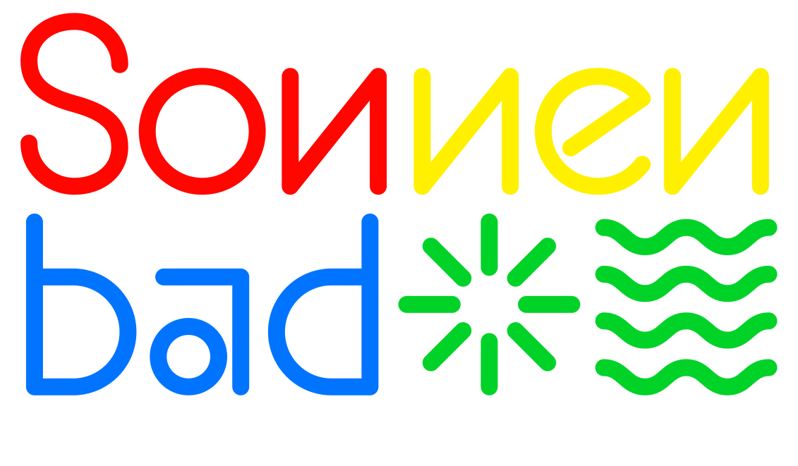
The Sonnenbad St. Margarethen near Basel is a place for refreshment and relaxation. Since its opening as the “Luft- und Sonnenbad St. Margarethen” in 1903, it has been managed by volunteers as a non-profit association. However, its current structural condition calls for a complete renovation. Architect Patrick Reuter is redesigning both the bathing facilities and the buildings. The new Sonnenbad features a natural swimming pool sustainable modular timber structures, and a photovoltaic system to power its summer operation. For the new facility, we designed a typeface, conceived as an integral part of the architecture.
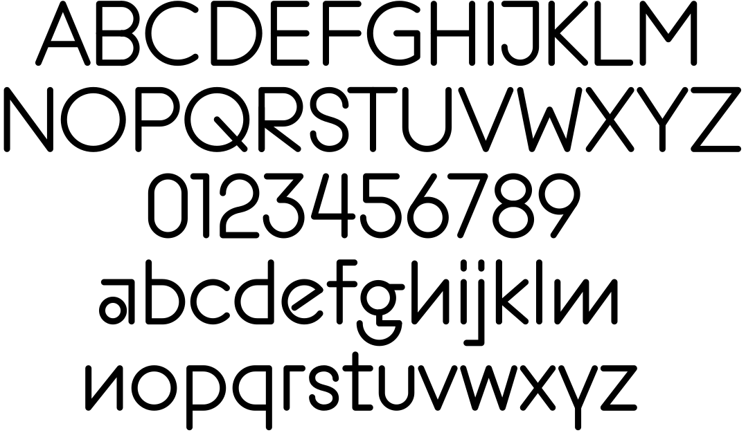
The key objectives of the new visual identity are recognisability, flexibility and a family-friendly character. The typeface forms the core of the visual identity. It is based on historical geometric type designs such as Paul Renner’s Futura (c. 1927) and Rudolf Koch’s Kabel (c. 1930). The letterforms are more geometric than those of conventional typefaces to create a distinctive appearance that is immediately recognisable.
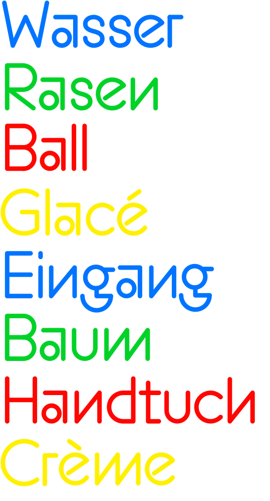
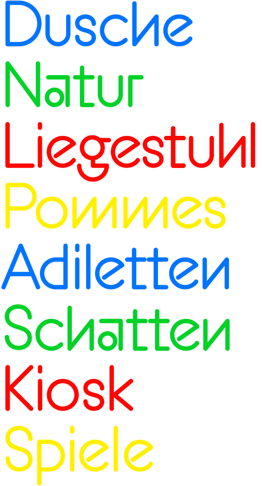
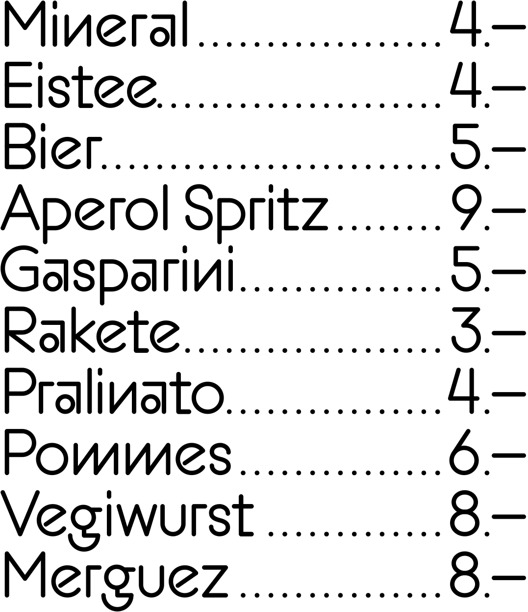
The Sonnenbad typeface is primarily intended for display use. Legibility is of course important, but in this particular context, it is not the main concern. Visitors to the swimming facility are in leisure mode, so the experience takes precedence over efficiency.
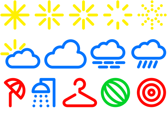
In addition to the standard character set, we have developed a set of pictograms to support communication across different languages through visual means. The typeface and pictograms are designed to complement the architecture and appear in a range of vibrant colours.
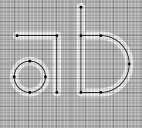
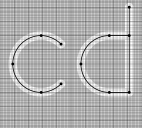
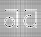
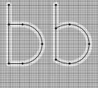
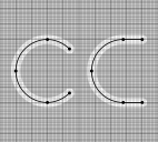
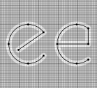
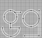
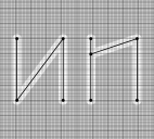
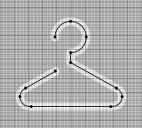
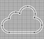
All characters and pictograms are drawn on a square grid with a maximum height of 100 units. This simplified grid calls for straightforward decisions, while still allowing for variations in the construction of the individual characters. Unlike conventional digital typefaces, the Sonnenbad typeface was designed as a skeleton, defining the stroke width as an outline without optical corrections. This is due to its specific use. See further down…
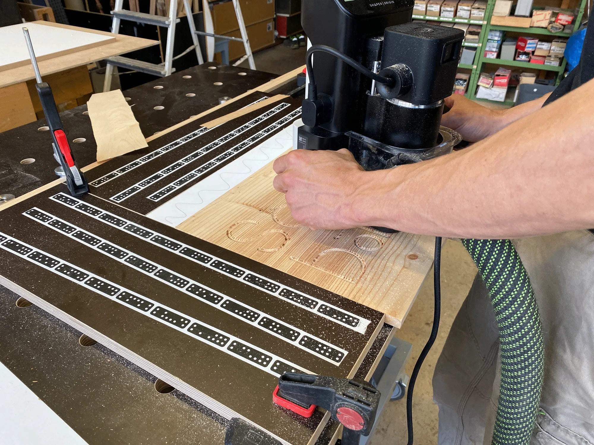
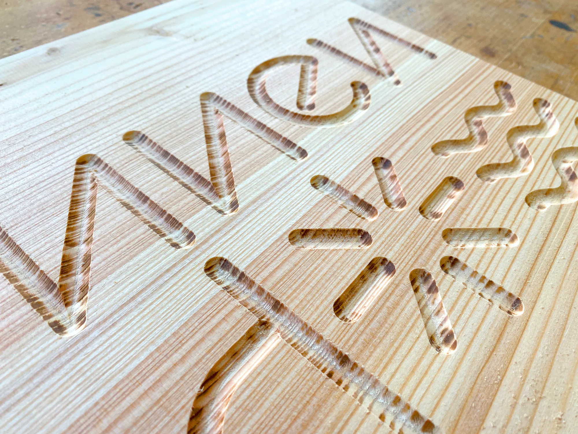
The skeleton enables a hand-guided CNC milling machine to trace the letterforms and carve the desired stroke width directly into the wood. Modern milling technology makes it possible to transfer the drawings with a high degree of precision. The letters, with their softly rounded edges, are then hand-painted and varnished.
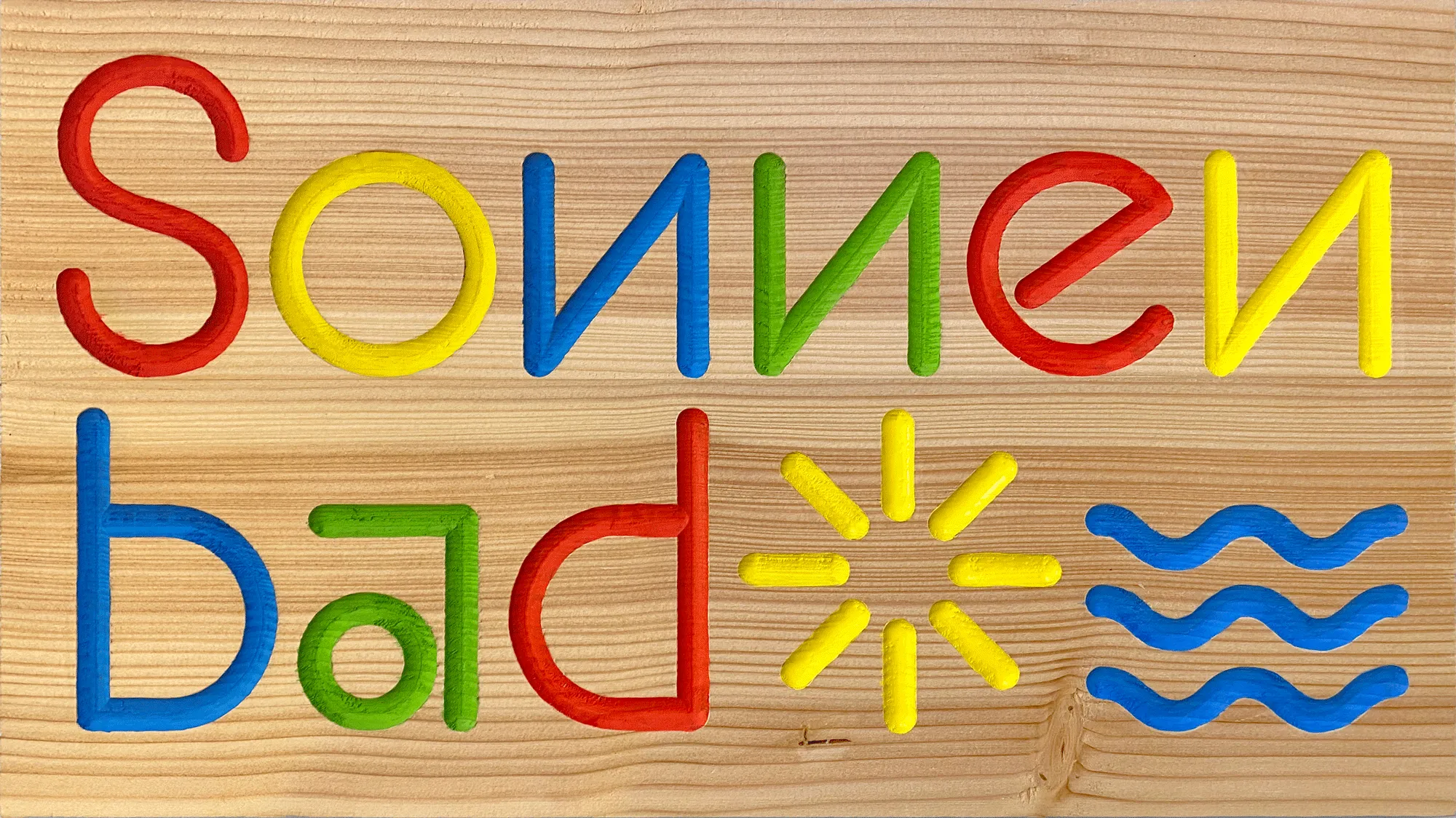
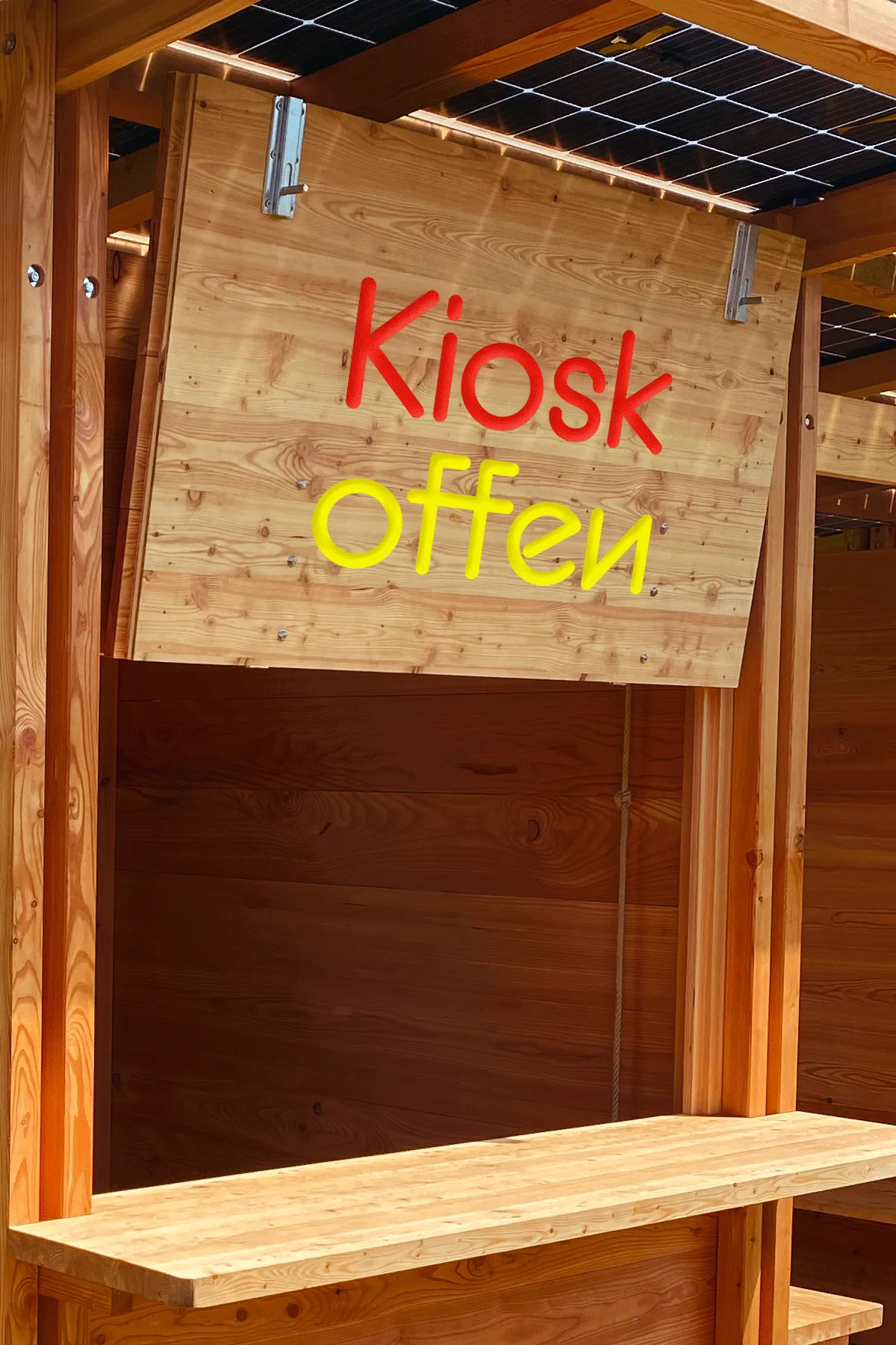
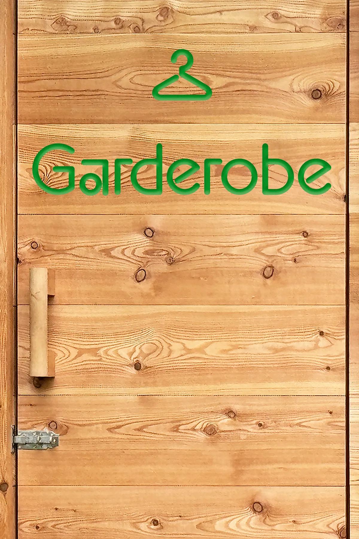
The key objectives of the identity are well reflected in this visual type concept. Recognisability is achieved through the distinctive letterforms, flexibility through the typeface being conceived with its materials and applications in mind, and a family-friendly character through the rounded, tangible letterforms.
Uppercase Latin
- A
- Á
- Â
- Ä
- À
- Æ
- B
- C
- Ć
- Ç
- D
- E
- É
- Ê
- Ë
- È
- F
- G
- H
- I
- Î
- Ï
- IJ
- J
- K
- L
- M
- N
- O
- Ó
- Ô
- Ö
- Ò
- Œ
- P
- Q
- R
- S
- ẞ
- T
- U
- Ú
- Û
- Ü
- Ù
- Ů
- V
- W
- X
- Y
- Ÿ
- Z
Lowercase Latin
- a
- á
- â
- ä
- à
- æ
- b
- c
- ć
- ç
- d
- e
- é
- ê
- ë
- è
- f
- g
- h
- i
- ı
- î
- ï
- ij
- j
- ȷ
- k
- l
- m
- n
- o
- ó
- ô
- ö
- ò
- œ
- p
- q
- r
- s
- ß
- t
- u
- ú
- û
- ü
- ù
- ů
- v
- w
- x
- y
- ÿ
- z
Figures
- 0
- 1
- 2
- 3
- 4
- 5
- 6
- 7
- 8
- 9
Punctuation
- .
- ,
- :
- ;
- /
- \
- -
- –
- —
- _
- (
- )
Symbols
- 🚿
- ☁
Marks
- ¨
- ˙
- `
- ´
- ˆ
- ¸
Sonnenbad was commissioned by Sonnenbad St. Margarethen, Binningen and developed between 2024 and 2025. The process was supported by the Sonnenbad Foundation. Architect Patrick Reuter contributed to the conceptual development, and Fabian Peña carefully carried out the milling work. Many thanks to Samuel Werenfels and Thomas Holinger for their trust and for a successful and enjoyable collaboration.
Sonnenbad is currently not available commercially, but it may be released as a retail typeface in a revised form at a later date.