Kunsthalle Wien
In a competition held in 2024, the Kunsthalle Wien was seeking a new corporate identity. Instead of pursuing a long-standing collaboration between Vienna and Basel, I developed a typeface and an easy-to-use design system. The brief called for a font that was accessible, confident, and unmistakably unique. While letterforms with Jugendstil (Art Nouveau) skeletons offered a compelling visual reference, they often felt overly nostalgic, mannered, or just too blunt. The breakthrough came by combining Art Nouveau-inspired capital letters with contemporary lowercase shapes, creating a relaxed, open rhythm that unites Vienna’s rich art-historical legacy with the vibrant contemporary art scene. The resulting irony is entirely intentional.
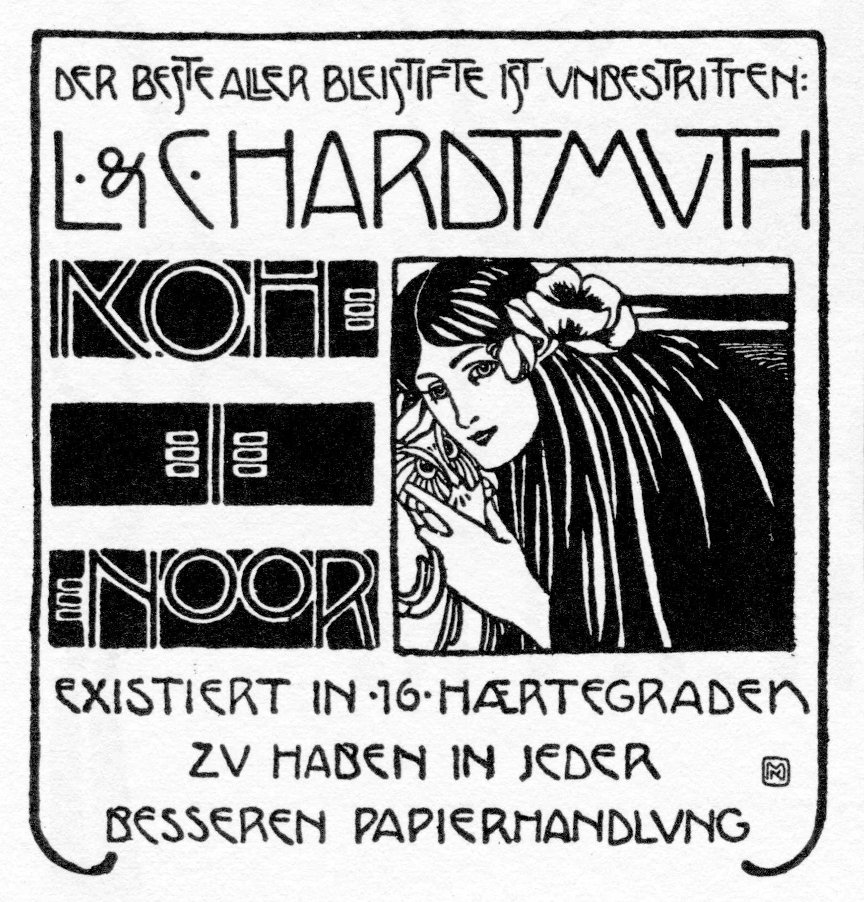
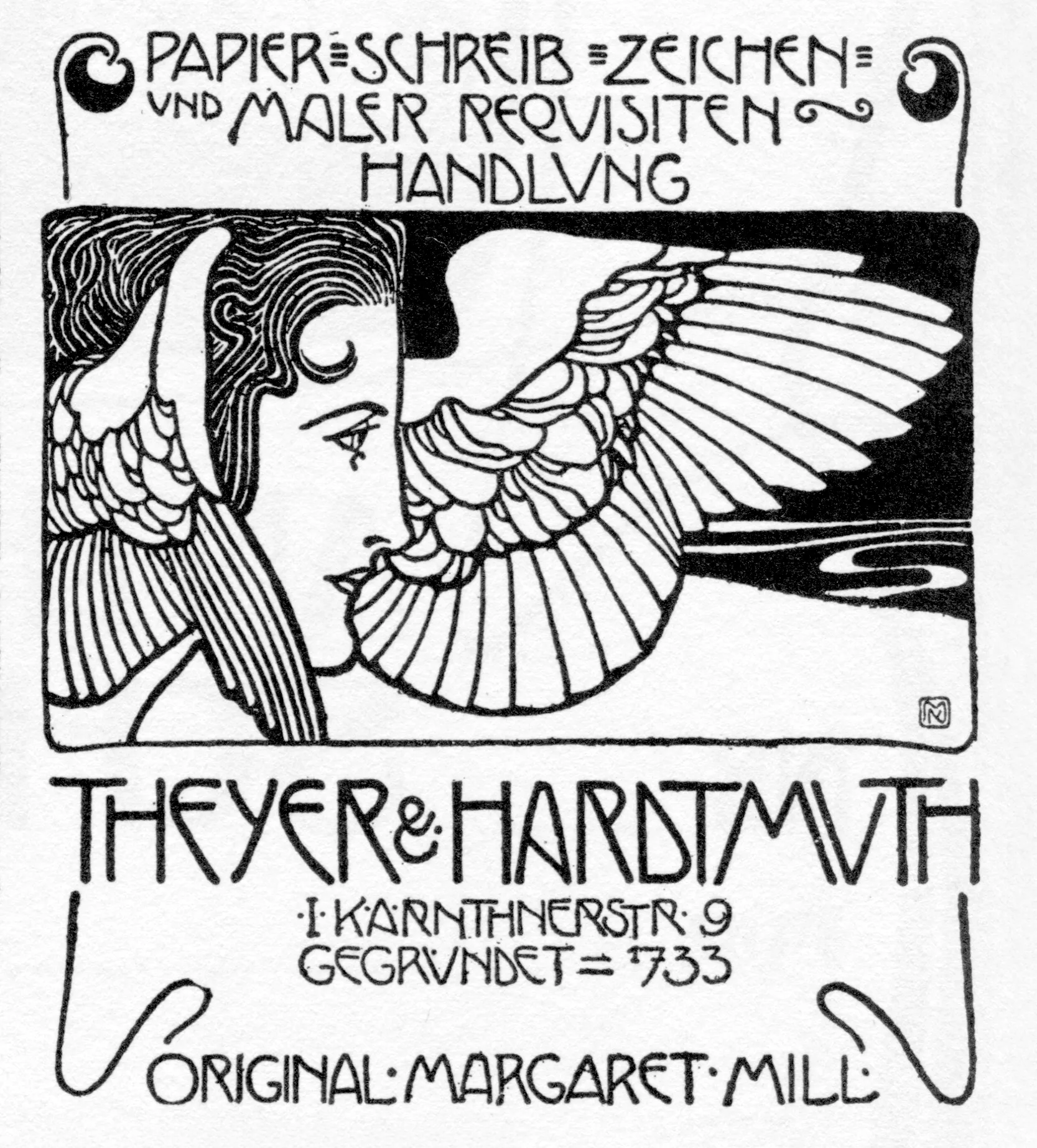
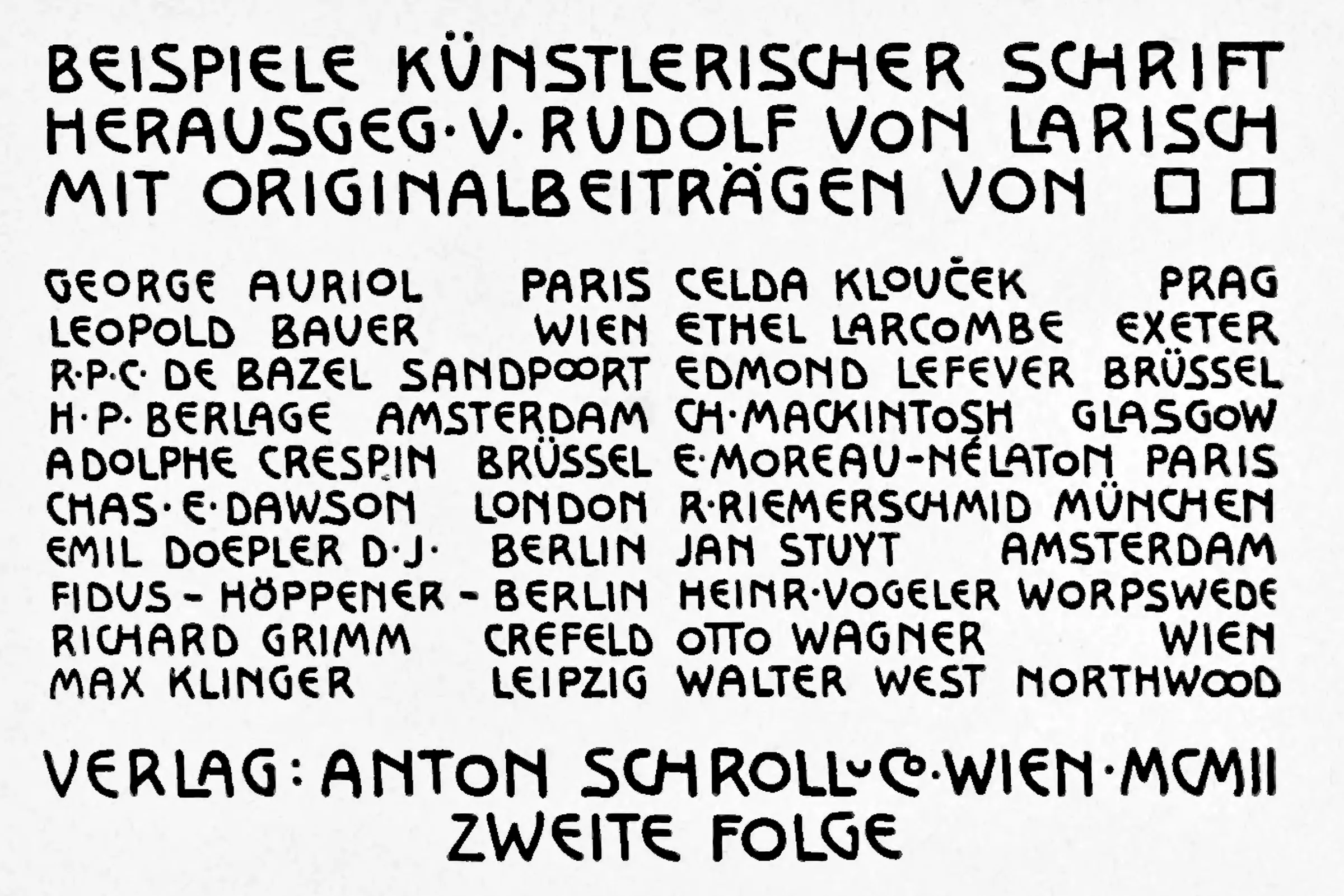
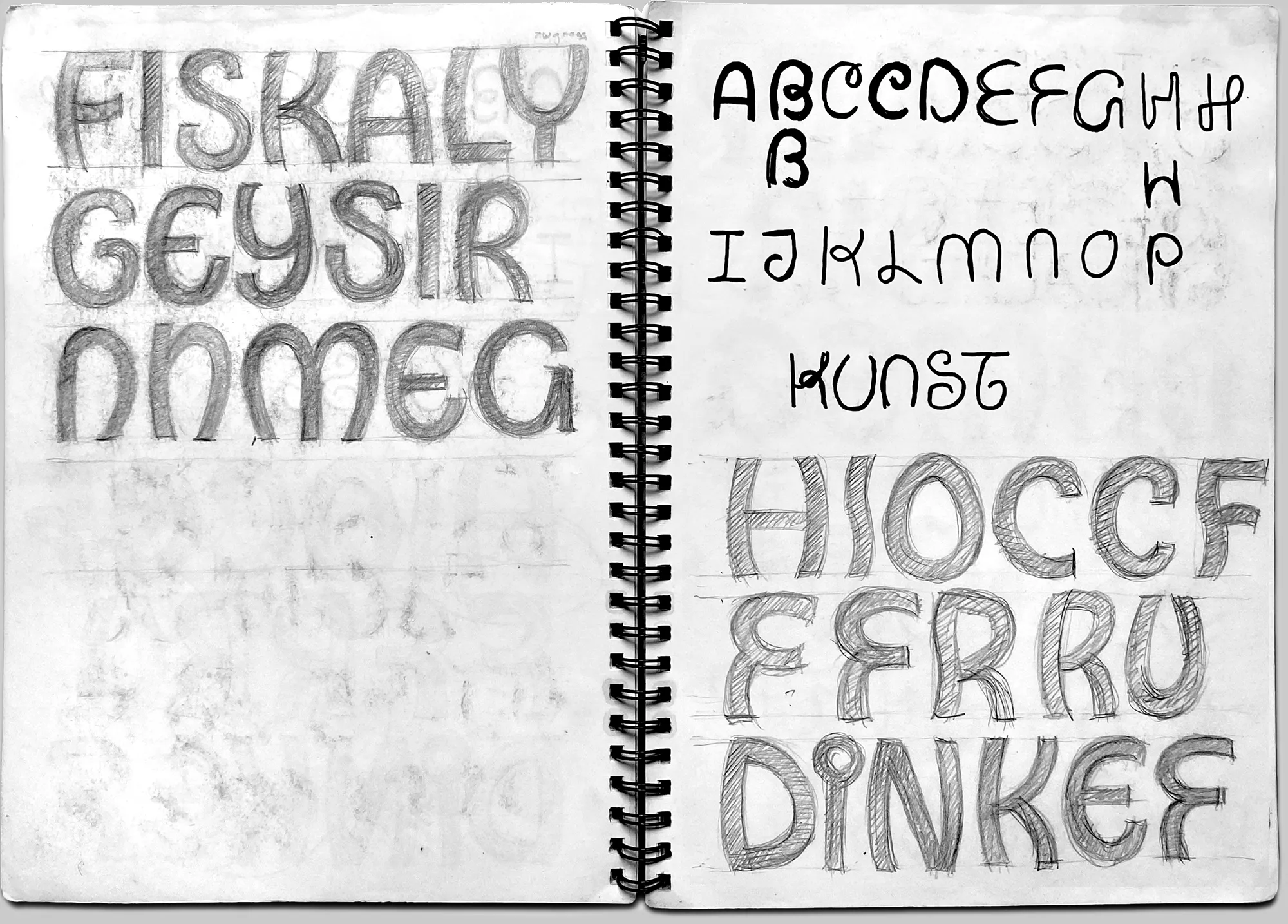
The most important historical references for the typeface design for the Kunsthalle Wien come from Koloman Moser and Rudolf von Larisch. Two advertisements by Koloman Moser, Vienna, c. 1900, a table of contents from “Beispiele künstlerischer Schrift” [Examples of Artistic Typefaces], Rudolf von Larisch, Vienna, 1902, below, my sketchbook.
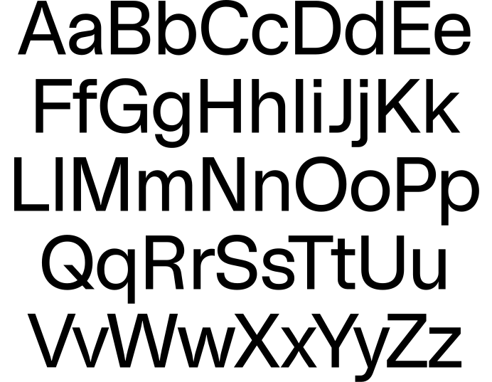
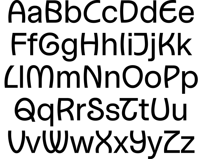
The basis is a draft for a generic sans-serif typeface I started in 2015. In the Kunsthalle Wien display version, the uppercase letters are replaced by historically inspired forms. Their skeletal structures are based on Art Nouveau design principles, while the proportions, contrast and stroke ends are adapted to the sans-serif style.
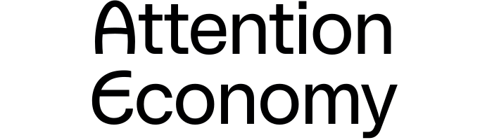
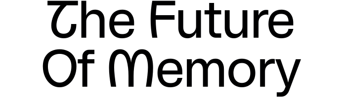
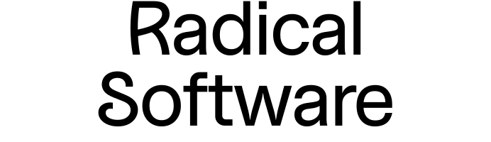
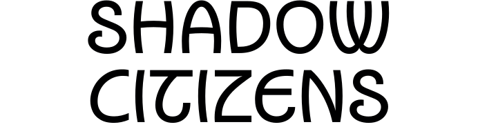
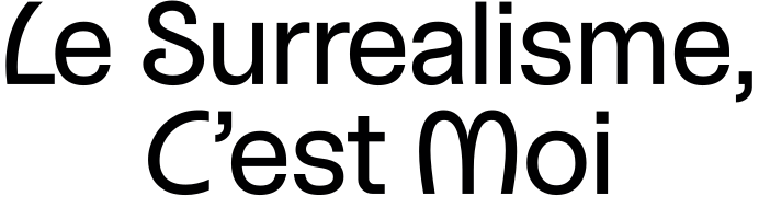
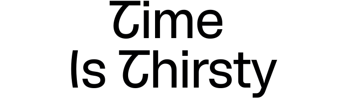
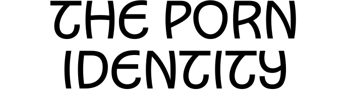
When applied to the titles of past exhibitions at the Kunsthalle Wien, the strong and distinctive identity of the institution is brought to the fore; even without a logo, the source is clear.
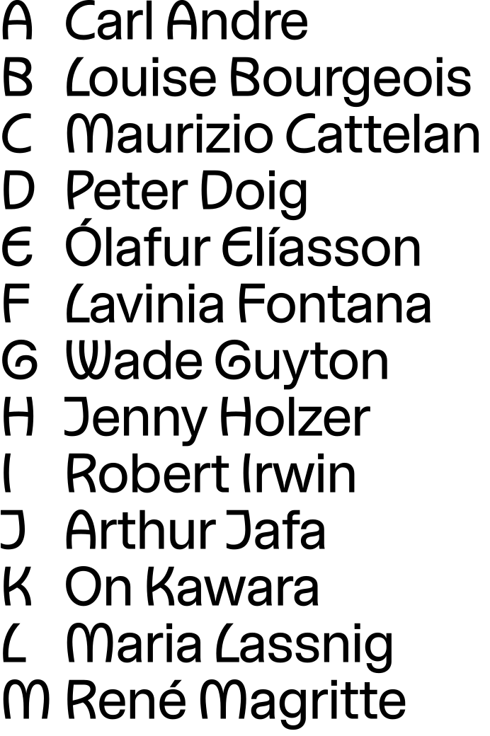
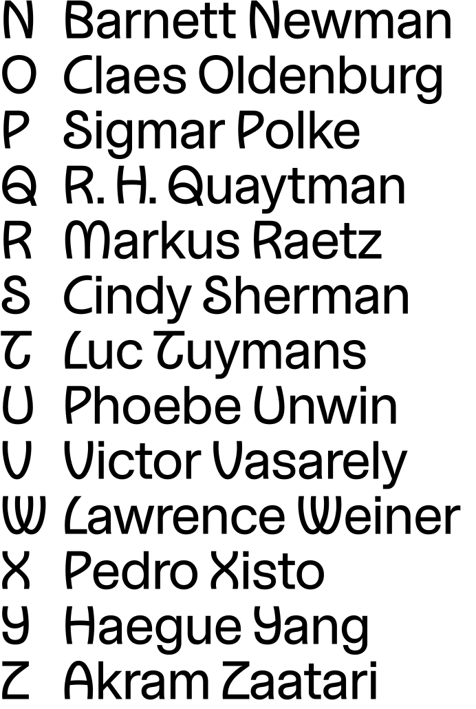
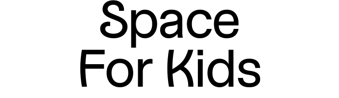
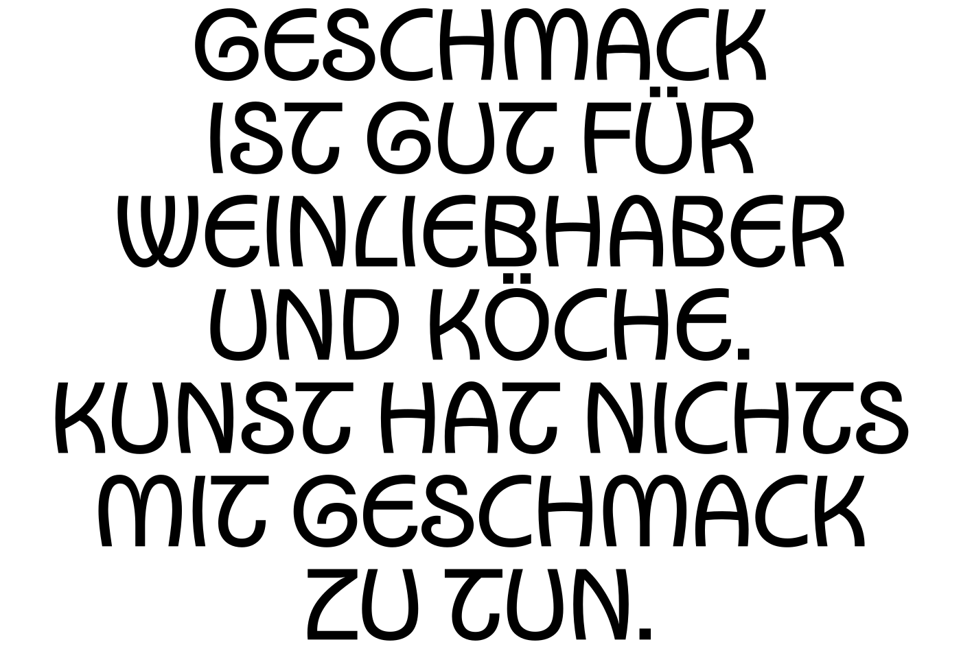
In the text application, the deliberate sense of dissonance is created by the combination of the two typographic principles. The shared grey tone ensures consistency, whilst the naturally higher frequency of lower-case letters gives the overall design a contemporary feel.
There are three typefaces for everyday use: Kunsthalle Wien Display is used for logos, headlines and signage, down to 32 pt or 32 px. For smaller text and body copy, there are Kunsthalle Wien Regular and Italic.
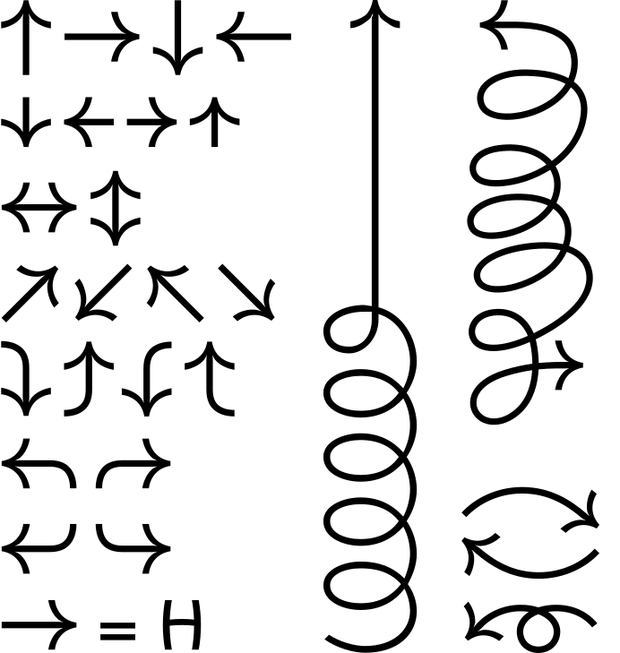
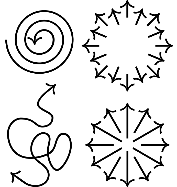
In addition to the characters covering 200 languages written in Latin script, the Kunsthalle Wien typeface includes a growing range of arrows. These are used in the wayfinding system and as a highlighting or decorative element in printed and digital communications.
Uppercase Latin
- A
- Á
- Ă
- Ǎ
- Â
- Ä
- Ạ
- À
- Ā
- Ą
- Å
- Ǻ
- Ã
- Æ
- Ǽ
- B
- C
- Ć
- Č
- Ç
- Ĉ
- Ċ
- D
- Ð
- Ď
- Đ
- E
- É
- Ĕ
- Ě
- Ê
- Ë
- Ė
- Ẹ
- È
- Ē
- Ę
- Ẽ
- Ə
- F
- G
- Ğ
- Ǧ
- Ĝ
- Ģ
- Ġ
- Ḡ
- H
- Ħ
- Ĥ
- I
- Í
- Ĭ
- Î
- Ï
- İ
- Ị
- Ì
- Ī
- Į
- Ĩ
- IJ
- J
- Ĵ
- K
- Ķ
- L
- Ĺ
- Ƚ
- Ľ
- Ļ
- Ŀ
- Ł
- M
- N
- Ń
- Ň
- Ņ
- Ɲ
- Ñ
- Ŋ
- O
- Ó
- Ŏ
- Ô
- Ö
- Ọ
- Ò
- Ő
- Ō
- Ǫ
- Ø
- Ǿ
- Õ
- Œ
- P
- Þ
- Q
- R
- Ŕ
- Ř
- Ŗ
- S
- Ś
- Ꞌ
- Š
- Ş
- Ŝ
- Ș
- ẞ
- T
- Ŧ
- Ť
- Ţ
- Ț
- U
- Ú
- Ŭ
- Û
- Ü
- Ụ
- Ù
- Ű
- Ū
- Ų
- Ů
- Ũ
- V
- W
- Ẃ
- Ŵ
- Ẅ
- Ẁ
- X
- Y
- Ý
- Ŷ
- Ÿ
- Ỳ
- Ȳ
- Ỹ
- Z
- Ź
- Ž
- Ż
Lowercase Latin
- a
- á
- ă
- ǎ
- â
- ä
- ạ
- à
- ā
- ą
- å
- ǻ
- ã
- æ
- ǽ
- b
- c
- ć
- č
- ç
- ĉ
- ċ
- d
- ð
- ď
- đ
- e
- é
- ĕ
- ě
- ê
- ë
- ė
- ẹ
- è
- ē
- ę
- ẽ
- ə
- f
- g
- ğ
- ǧ
- ĝ
- ģ
- ġ
- ḡ
- h
- ħ
- ĥ
- i
- ı
- í
- ĭ
- î
- ï
- ị
- ì
- ī
- į
- ĩ
- ij
- j
- ȷ
- ĵ
- k
- ķ
- l
- ĺ
- ƚ
- ľ
- ļ
- ŀ
- ł
- m
- n
- ń
- ň
- ņ
- ɲ
- ñ
- ŋ
- o
- ó
- ŏ
- ô
- ö
- ọ
- ò
- ő
- ō
- ǫ
- ø
- ǿ
- õ
- œ
- p
- þ
- q
- r
- ŕ
- ř
- ŗ
- s
- ś
- ꞌ
- š
- ş
- ŝ
- ș
- ß
- t
- ŧ
- ť
- ţ
- ț
- u
- ú
- ŭ
- û
- ü
- ụ
- ù
- ű
- ū
- ų
- ů
- ũ
- v
- w
- ẃ
- ŵ
- ẅ
- ẁ
- x
- y
- ý
- ŷ
- ÿ
- ỳ
- ȳ
- ỹ
- z
- ź
- ž
- ż
Ligatures
- fi
- fl
Alternates
Figures
- 0
- 1
- 2
- 3
- 4
- 5
- 6
- 7
- 8
- 9
Tabular
Fractions
- ⁄
- ½
- ¼
- ¾
- ⅛
- ⅜
- ⅝
- ⅞
Small Numbers
- ₀
- ₁
- ₂
- ₃
- ₄
- ₅
- ₆
- ₇
- ₈
- ₉
- ⁰
- ¹
- ²
- ³
- ⁴
- ⁵
- ⁶
- ⁷
- ⁸
- ⁹
Ordinals
- ª
- º
Currency
- ¢
- ¤
- $
- €
- £
- ¥
Math
- +
- −
- ×
- ÷
- =
- ≠
- >
- <
- ≥
- ≤
- ±
- ≈
- ¬
- ~
- ^
- ∞
- ∫
- ∑
- %
- ‰
Arrows
- ↑
- ↗
- →
- ↘
- ↓
- ↙
- ←
- ↖
- ↔
- ↕
- ↰
- ↱
- ↲
- ↳
- ⬎
- ⬏
- ⬐
- ⬑
- ⇠
- ⇡
- ⇢
- ⇣
- ⤓
Punctuation
- .
- ,
- :
- ;
- …
- !
- ¡
- ?
- ¿
- ·
- •
- *
- #
- /
- \
- -
- –
- —
- _
- (
- )
- {
- }
- [
- ]
- ‚
- „
- “
- ”
- ‘
- ’
- «
- »
- ‹
- ›
- "
- '
Symbols
- 🍔
- 🎦
- 📄
- 📖
- 🔈
- 🔍
- 🗑
- 😊
- 🧺
- ○
- ✓
- ✔
- ❌
- ▷
- @
- &
- ¶
- §
- ©
- ®
- ™
- °
- |
- ¦
- †
- ‡
- ╳
- ⦻
- ⏸
- ⦿
Marks
- ¨
- ˙
- `
- ´
- ˝
- ˆ
- ˇ
- ˘
- ˚
- ˜
- ¯
- ¸
- ˛
Kunsthalle Wien’s typeface was developed between 2024 and 2025. Since then the typeface is used across all Kunsthalle Wien communications, from advertising and signage to internal documents. Our gratitude goes to Michelle Cotton for the trust, Katharina Baumgartner for the commitment, Marlene Zlabinger and Christoph Straganz for the endurance. Yousef Ghedjati contributed extensively to the drawing process, with testing and consulting support from Yves Graber.
Kunsthalle Wien Display is an exclusive design for Stadt Wien, Kunsthalle Wien. It is not for sale.